CASE STUDY
What if a hospitality venue's branding was as stylish as their Sunday brunch?
How we Infused a St Marys Landmark with Playful Chic and Elegance
For nearly a century, the St Marys’ home of the former Brell Tannery had laid dormant, waiting for a new purpose, a new vision. Enter Brell House - western Sydney’s hottest new gathering place; a space to eat, drink and celebrate. The owners had a vision - a desire to create a high-end venue that honoured the site’s rich history, while also embracing the region’s emerging culinary scene. They knew they needed a business name and brand identity that fused the tannery’s industrial roots with its premium foodie offering - a moniker, a logo, a colour palette, a distinct look and feel, that could successfully carry across everything from menus to social media. But how could it develop a completely new look and title for a cultural icon? How would the brand seamlessly pair the venue’s heritage with its new-world spirit of craft and innovation?
Combining industrial heritage with culinary chic
The owners had already paid homage to the site’s period charm with the venue design, but they were struggling to conceptualise what the business would look and feel like on paper.
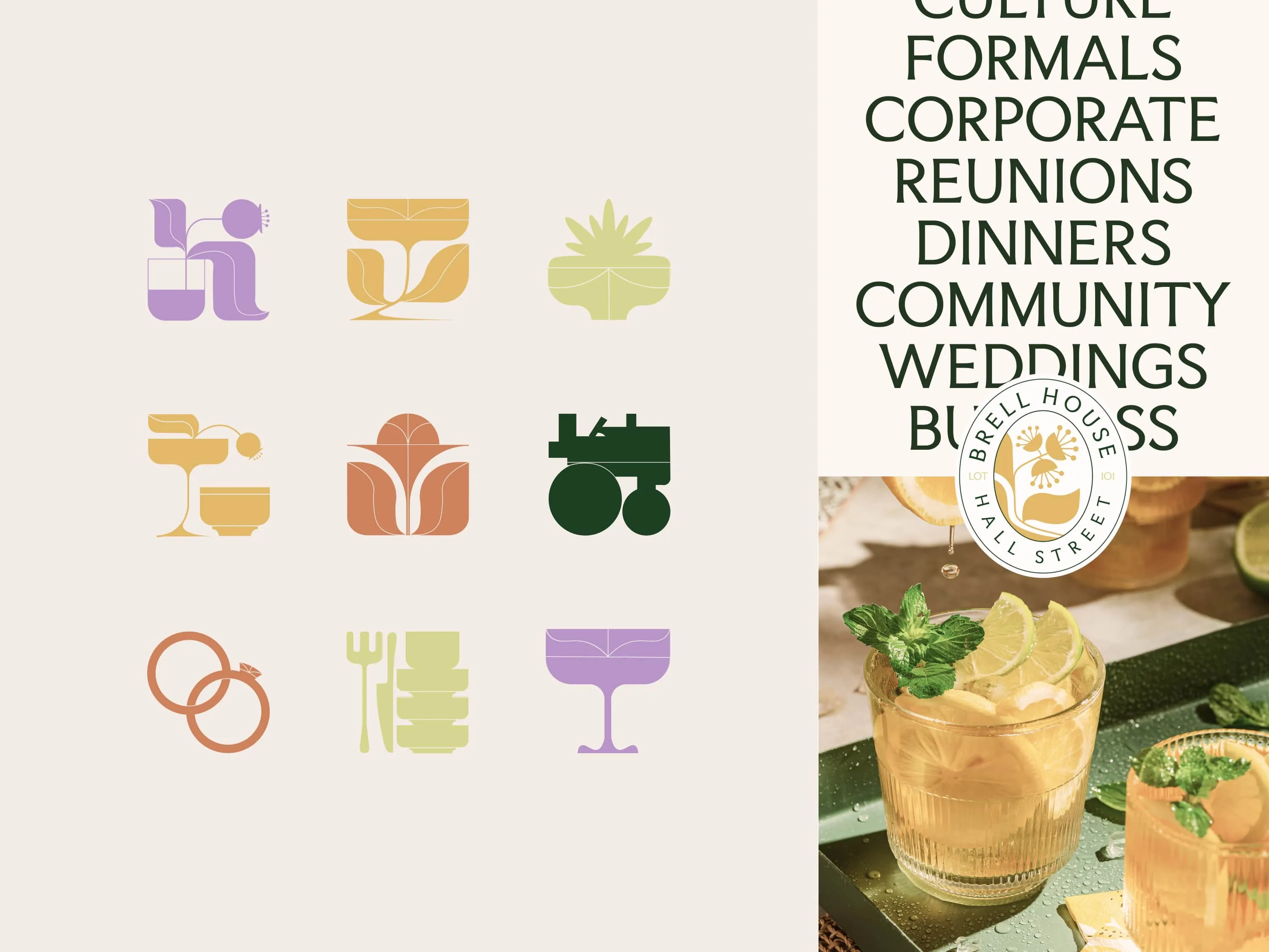
How every element - from the coasters to the curb-side signage - would represent the venue’s unique blend of style and history.
That’s where we came in.
We helped Brell House clearly articulate their core offering, their why, identifying their desire to create a name and a brand for a space where quality time meets quality flavours.
Delivering a mouth-watering brand
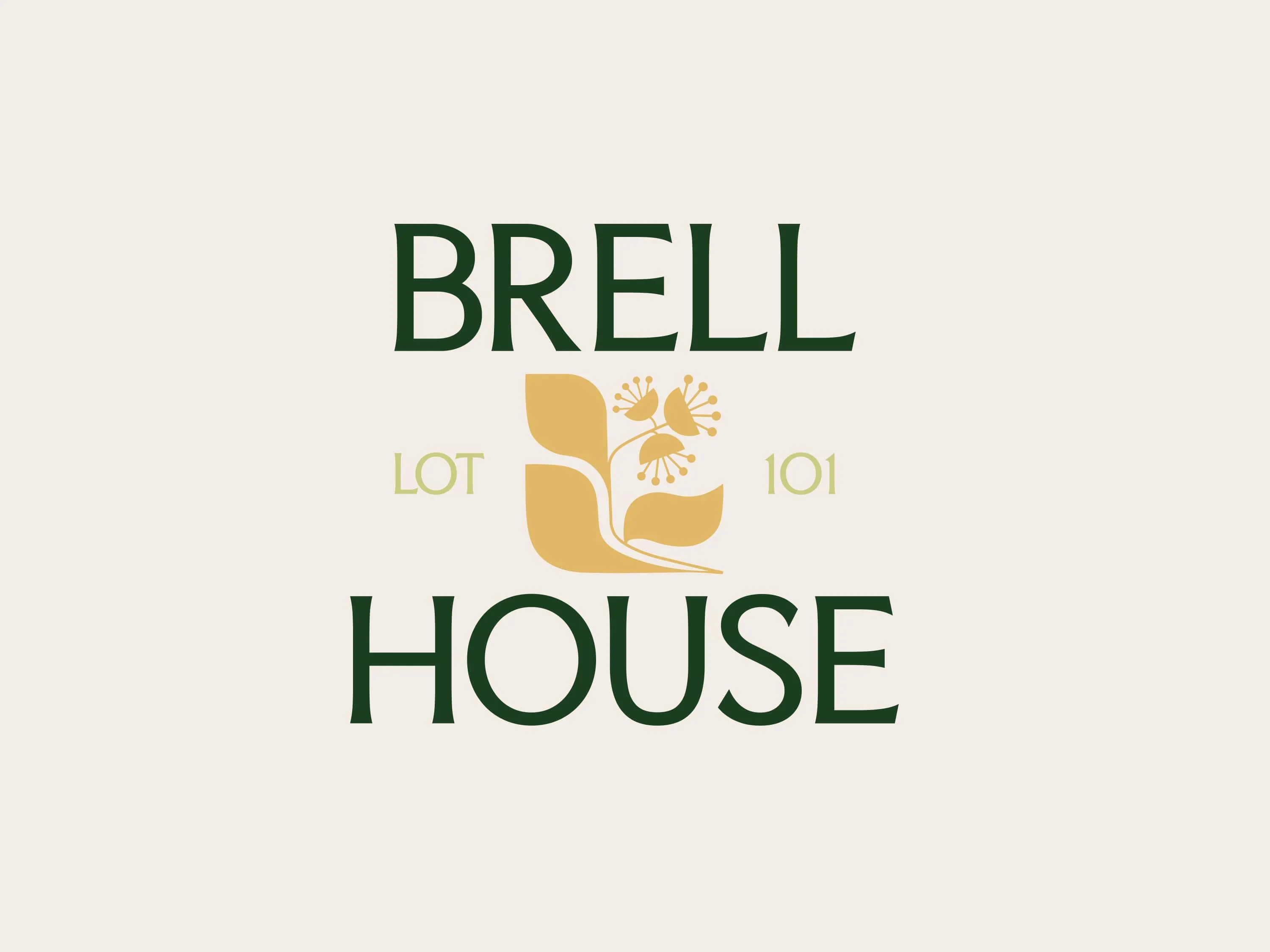
Building on that basis, we created Brell House - a name that matches history with hominess. The new name sparked the brand identity - a fusion of warmth and real-world class, inviting you in for a cocktail - with a side of character.

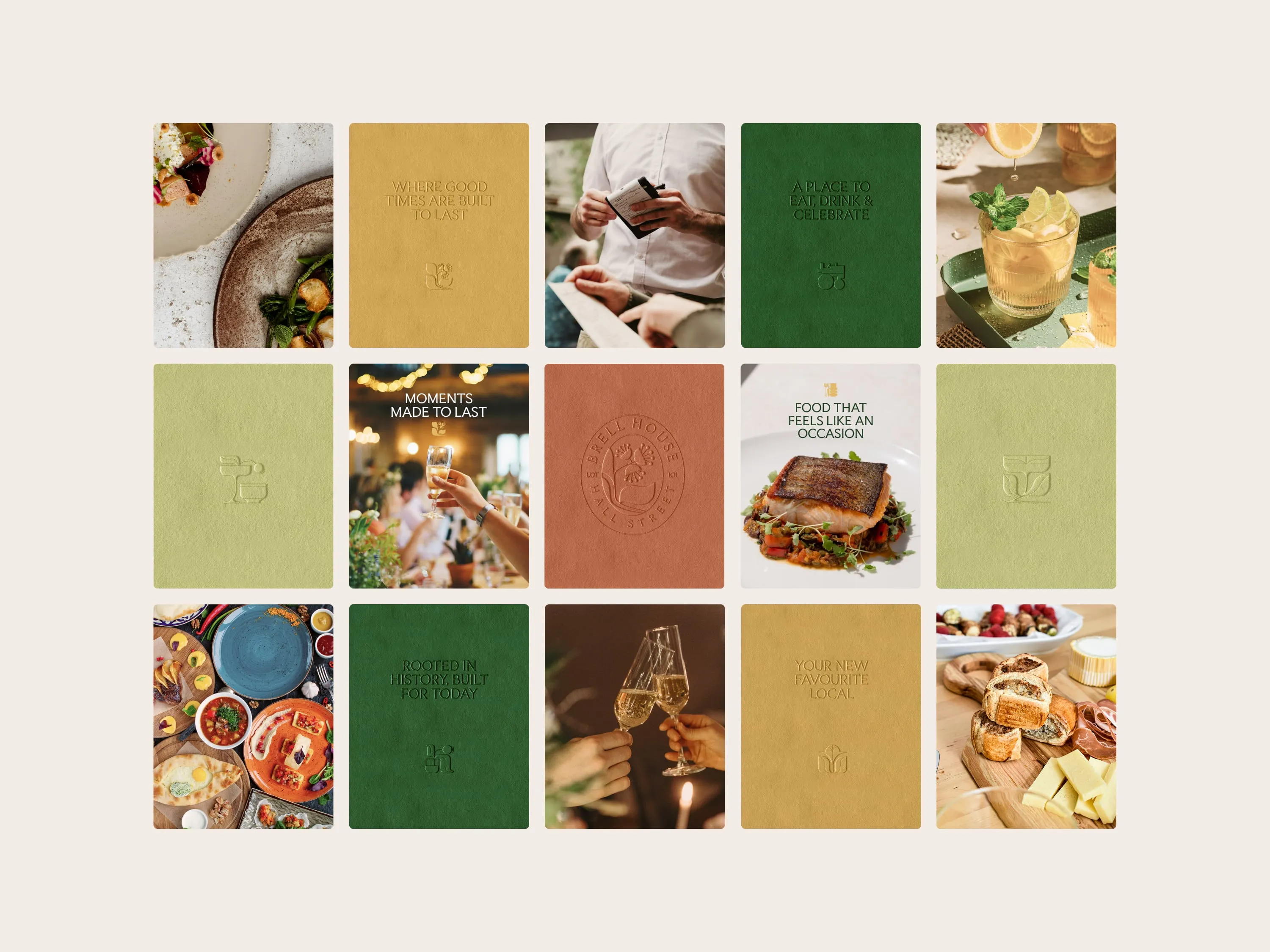
Shades of dark moss green, gold, terracotta and pale olive marry history with modern elegance, while the unique Brell House icon, the art deco-style illustrations and the glyphic font pair personality with heart - for a place you’ll want to gather, feast and play.
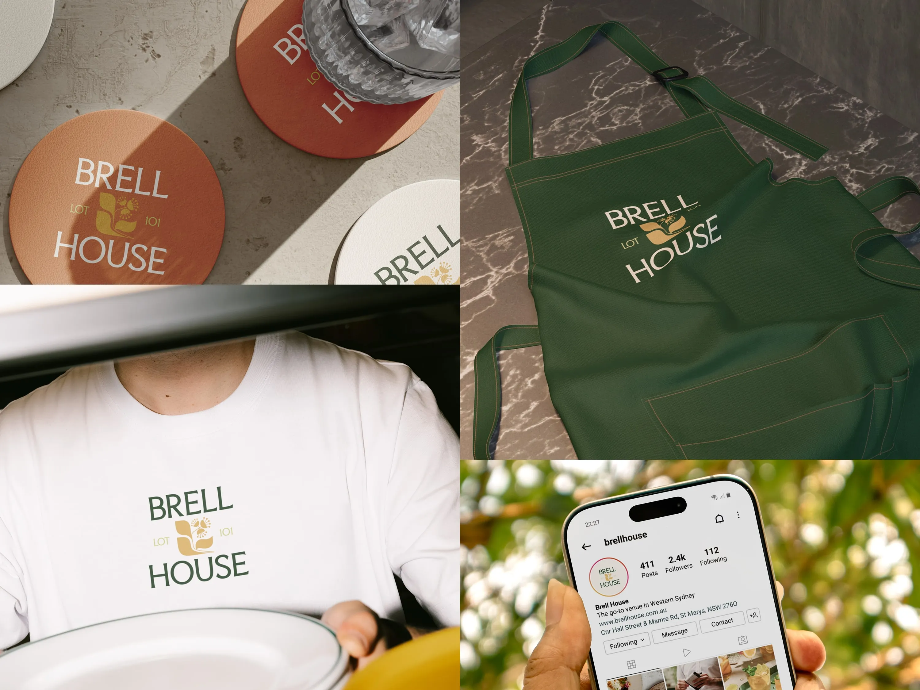

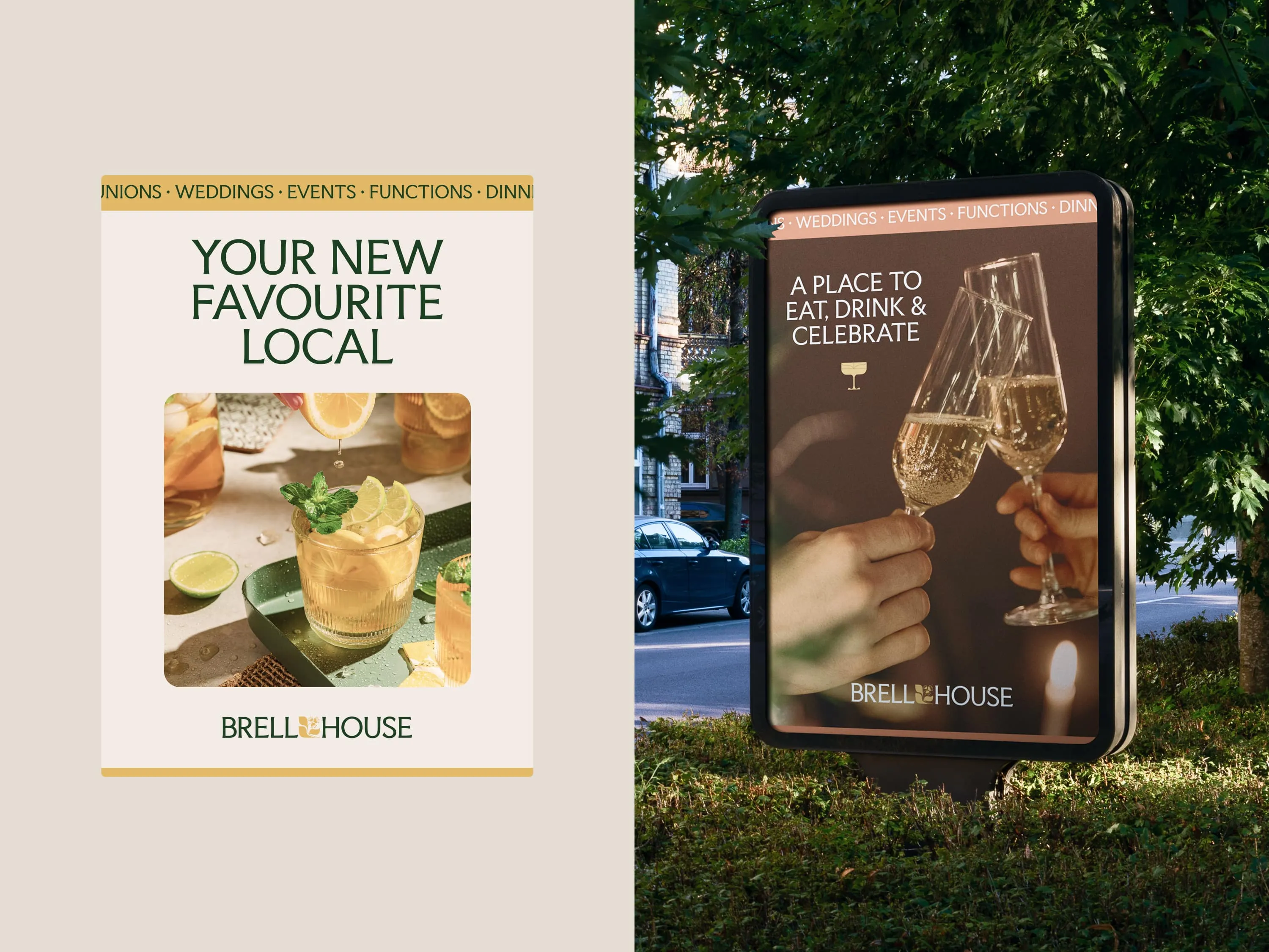
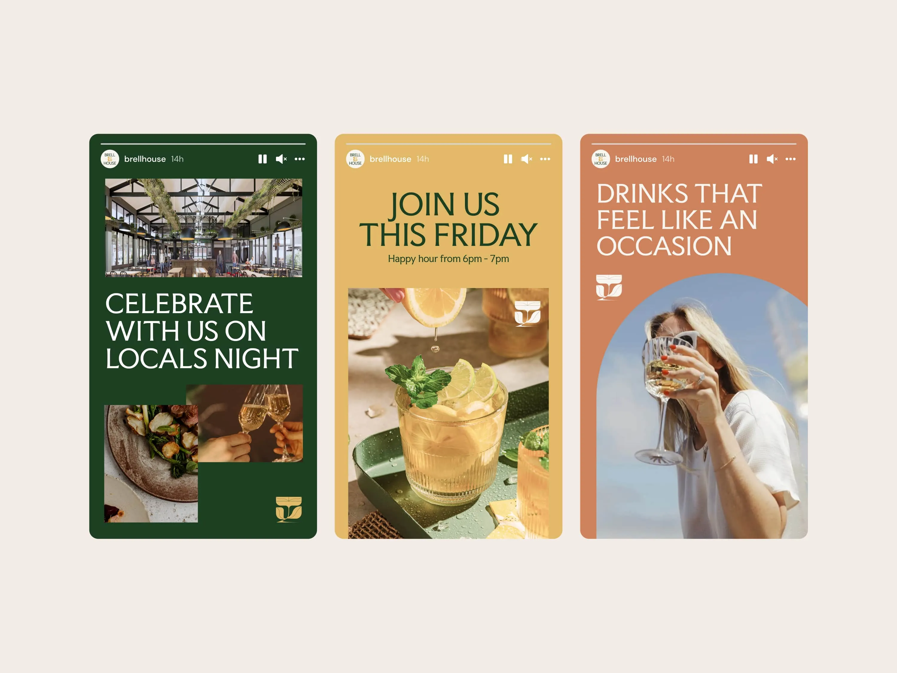
This sentiment continues through Brell House’s website, photography, social media presence and menu design, each created as a warm, inviting feast for the eyes - and the stomach.


Book a Call with a Specialist


Let’s grow your Business..


